Peloton Case Study Thumbnail

Peloton

Live and on-demand workouts delivered straight to your living room

PROJECT BRIEF

Augment the Peloton studio experience with a TV app that allows users to attend fitness classes right from their living room without needing any propietary hardware.

ROLE & RESPONSIBILITIES

Senior UX designer responsible for UI and interaction design for Roku’s discovery experience. Worked with a small team of client-side visual designers and in-house business analysts.

OUTCOME OVERVIEW

Designed a lean back 10ft experience that is immersive and user friendly to lower the barriers of entry for newcomers and extend Peloton’s ecosystem for existing customers.
Getting warmed up

App flow and account creation

After kick-off it became clear that the main problem that plagued Peloton at that time was that their existing mobile app did not paired well with users that exercised at home. Peloton wanted to deliver a better experience made for the living room by leveraging the widespread popularity of TV apps.

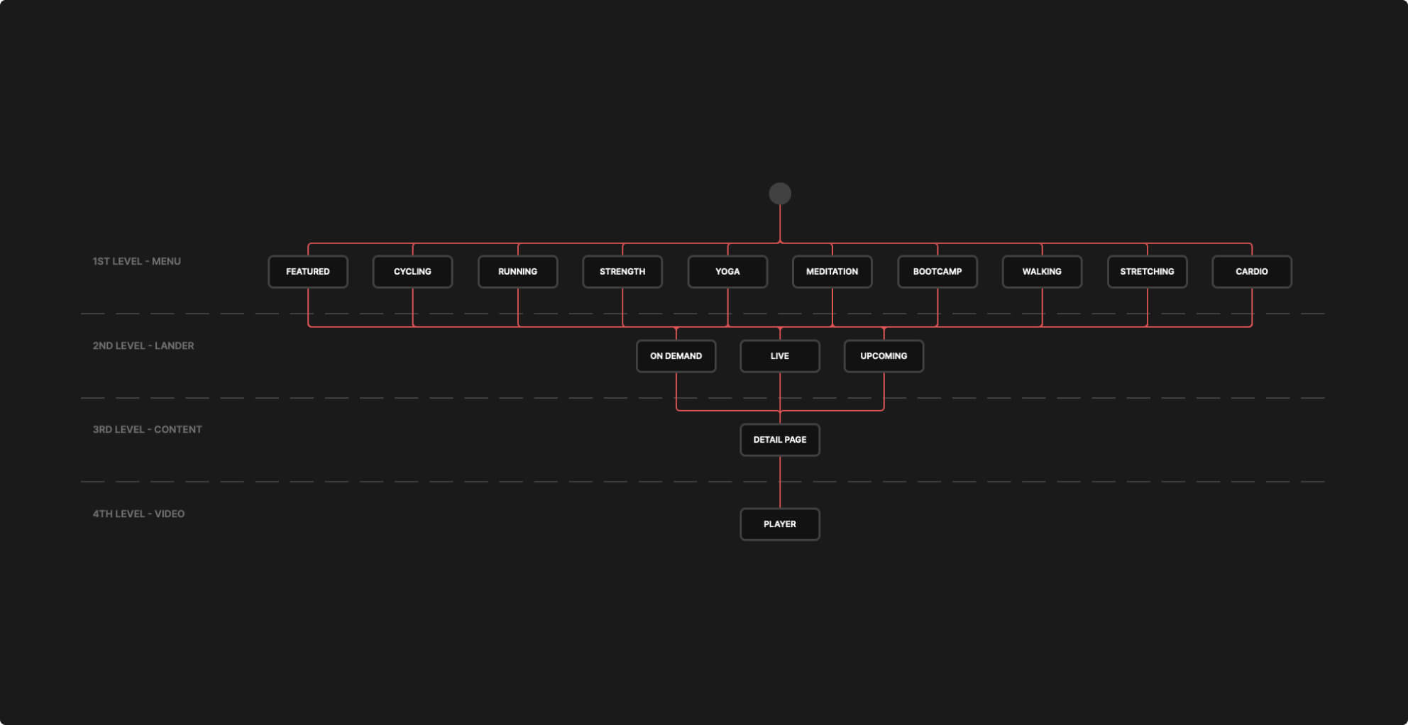
We started work by soaking up on existing UX research. Card sorting showed that the primary content categorization was based on workout types (running, cycling, strength, etc) followed by content state (live vs on-demand), which guided our IA towards a flat structure that played well with content discovery and 10ft interaction patterns.

Peloton Information Architecture
Workout-type driven, flat information architecture
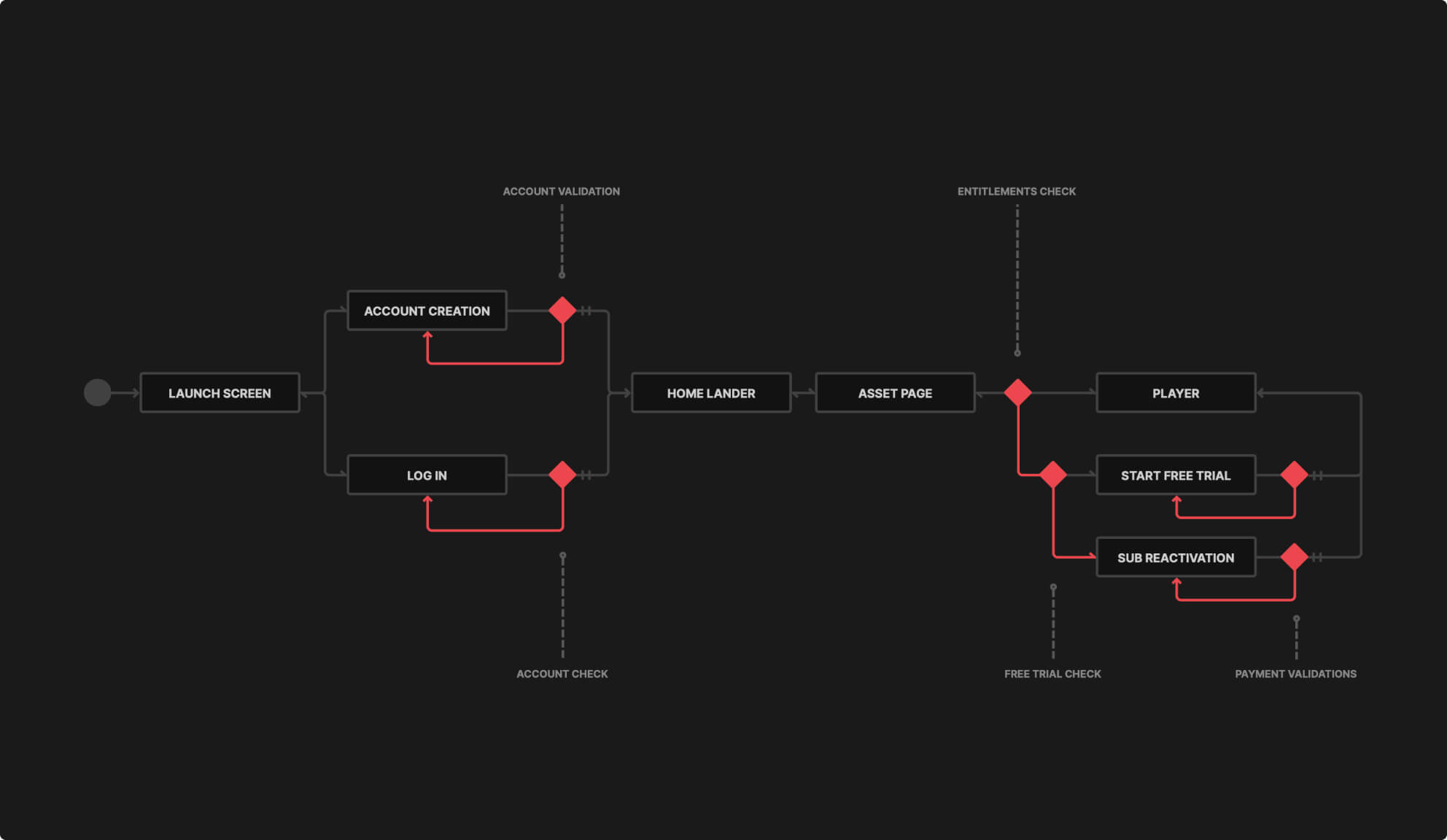
Peloton Interaction Flow
High level app flow emphasizing the discover, try and buy experience

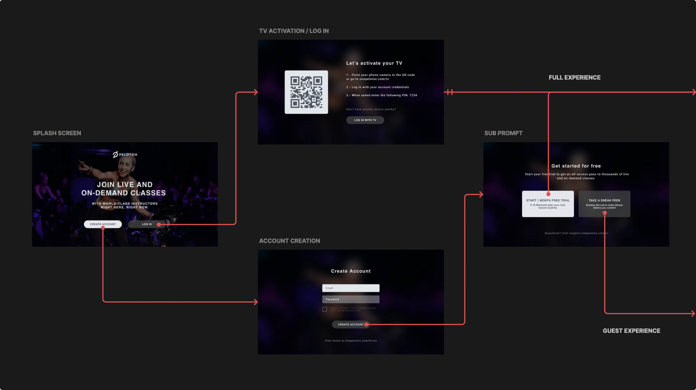
With their goals at hand we optimized for usability, adoption and growth by designing flows that were as frictionless as possible.

PIN authentication allowed users to login easily without using a directional pad controller as keyboard input. Also by letting users browse the content first, payment prompts in the app were mostly driven by user intent.

Peloton Authentication Flow
First time only app authentication

Attend live and on-demand classes

Content audit and UI components

Through an audit we divided content between live classes (studio streams) and on-demand classes (recorded sessions) which were organized in fitness categories like strength, yoga, running & more.

To create a visual representation for each group we dived into the metadata, analyzing everything from image ratios to string lengths.

Making workouts discoverable

Information architecture and navigation

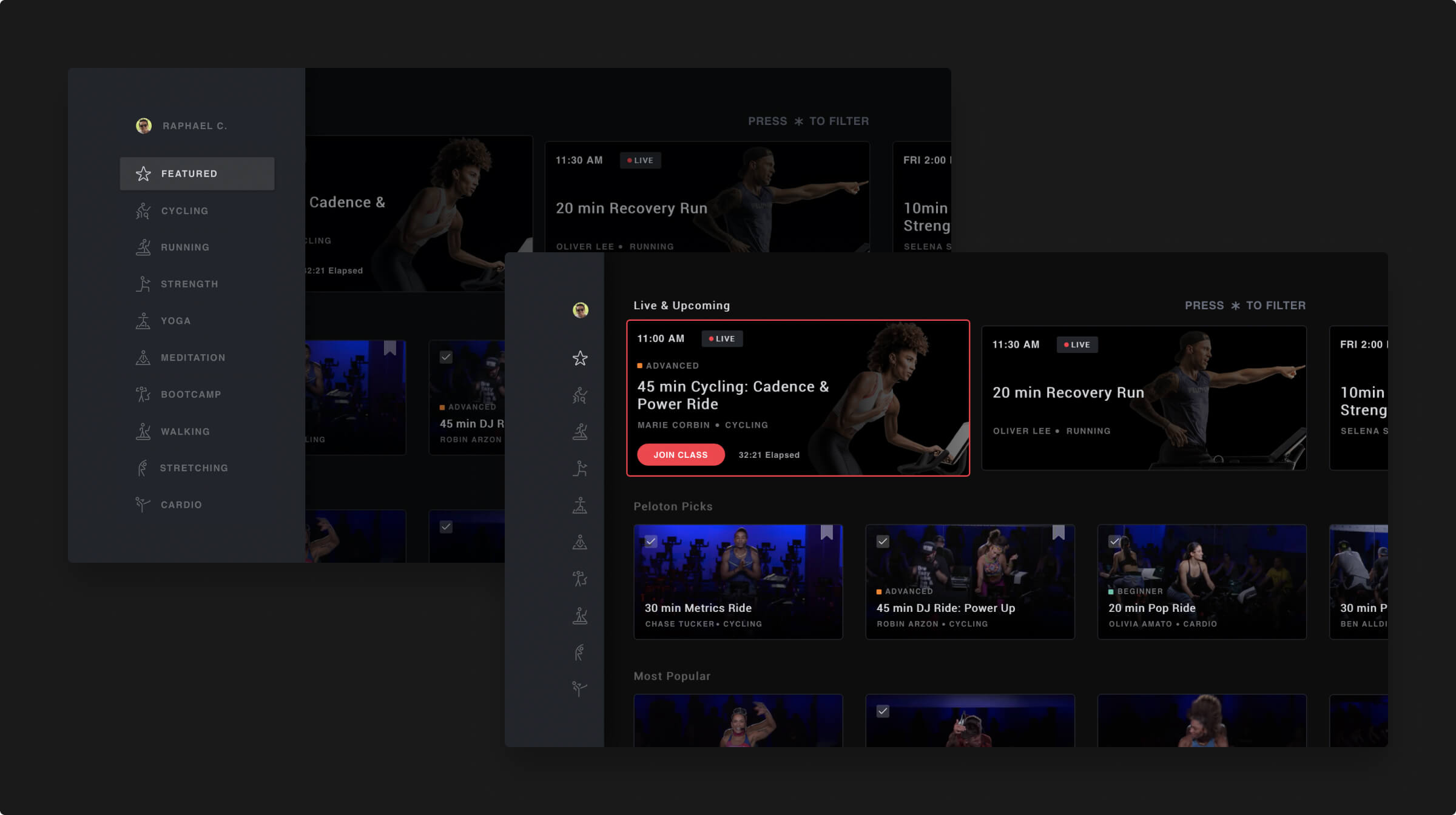
Once inside a lander the first lane featured either live classes, encore classes (broadcasted repetitions) or upcoming classes, whereas the subsequent lanes or grid displayed recorded classes from Peloton’s ever growing on-demand library.

In addition to that, a flat information architecture avoided repetitive interactions and nested navigations that hurt content discovery.

Peloton Menu and Featured Lander
Sidebar menu and featured lander with curated lanes
Menu navigation interaction from prototype

The sidebar menu had the advantage of being always accessible and iconography for fitness categories became a recognizable visual queue that didn't take much screen real estate.

Interaction wise, mapping d-pad remote controller actions to the UI correctly was crucial to build a TV navigation that felt responsive, predictable and natural after every use.

Lane navigation interaction from prototype

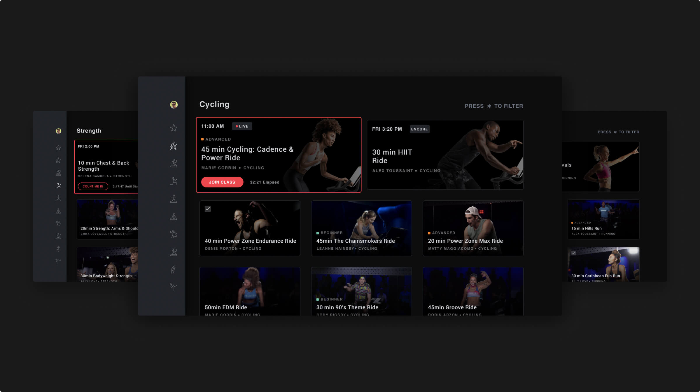
Beyond the curated featured lander, users could browse any of the nine fitness categories or workout disciplines available and find a mix of live plus on-demand classes. Variety is the spice of life right?

Peloton Workout Landers
Landers for strength, cycling and running training with content grids

Matching content to your needs

Filter and find classes across the app

We knew that just making content discoverable is not enough, that’s why we cared for findability as well.

Instead of exposing the complexity to users we went ahead of them and researched the most popular ways classes were searched to create attributes through which we could later look for content using filters.

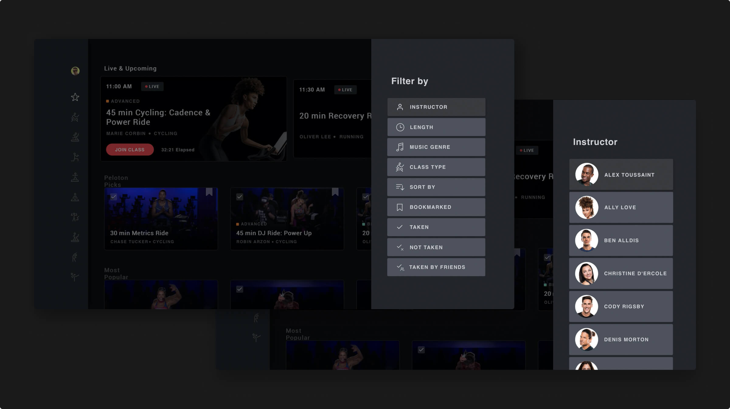
Peloton Content Filters
Advanced filtering controls available on each lander
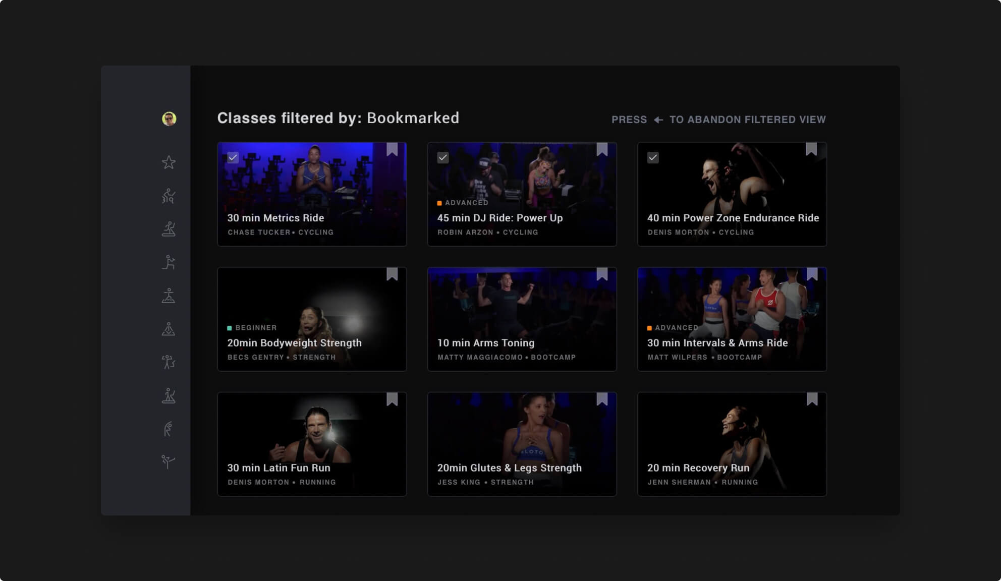
Peloton Content Filtered
Filtered content view

Adapting to the specific interaction patterns on TV, we made the product tradeoff of replacing regular query-based search for these taxonomy-driven filters which would make the input quicker, smoother and prevent returning inaccurate or empty results.

Users could trigger filters on any lander by pressing the “options” key on their remote and navigate the lateral drawer with the d-pad.

Filters interaction from prototype

Diving into each class plan

Asset metadata organization and display

Working closely with Peloton’s content and graphic design teams we leveraged their existing media assets to bring the studio experience home.

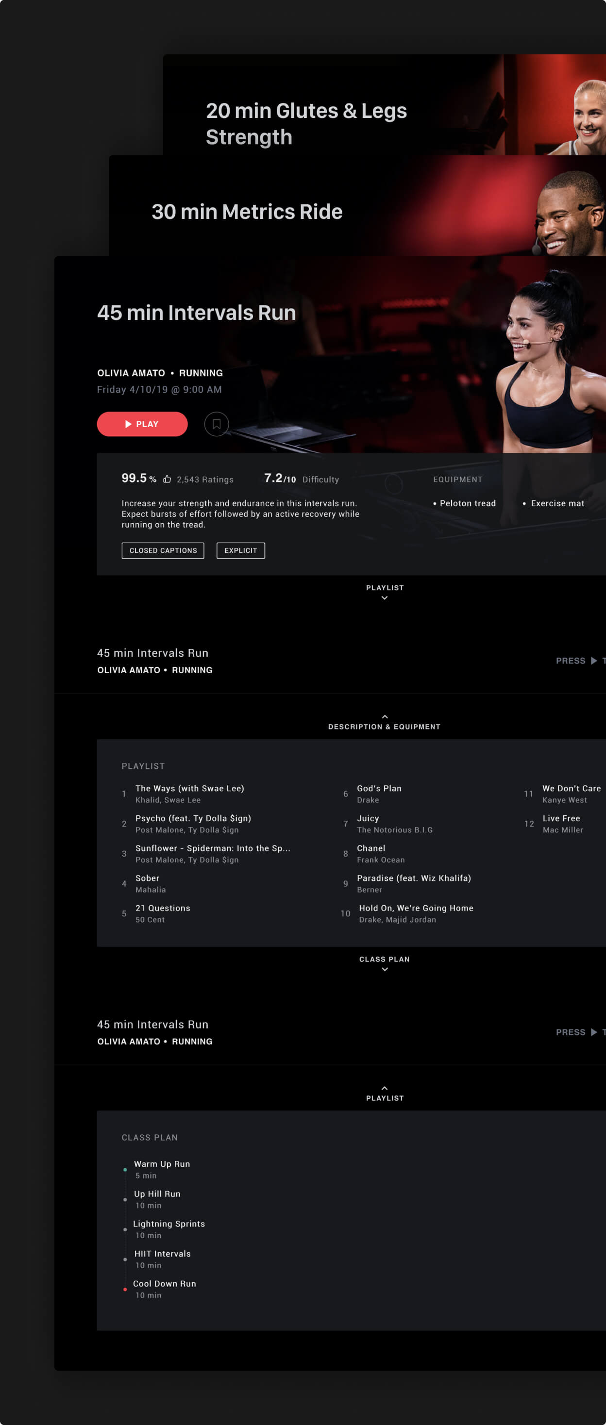
Being the intermediate step between the landers and the video player, detail pages showcased in-depth information about each workout.

From class plan to instructor and equipment to playlist, we pulled every piece of relevant metadata for users to make an educated decision at a glance.

Peloton Class Details
Class details page interaction from prototype

When designing class details we also took care of the transitions between landers and assets by masking loading times.

When done correctly, those transitions provide a sense of continuity and feedback to users while minimizing the negative impact of unavoidable system-side processes.

Cooling down

Project outcome & reflections

To facilitate the design-to-dev handoff we went beyond static mockups and built an interaction and motion sandbox that contained all our prototypes using code as the common language for anything from transitions to micro-interactions.

Although I would have loved to devote more time to further strategic analysis, by using it to deepen proposals with technical and tactical explorations I learned that the ROI of embedding interactivity in your deliverables early-on is extremely high.

Once we did it we never looked back, it became an integral part of communicating ideas (internally, top-down and bottom-up) and testing concepts (externally, with users) at any point.

Date

Mid-2019

Platforms

10ft — Roku

Tools

Invision, Sketch & Framer

Team

Alejandro Castells — Design Director

Juan Espinoza — Business Analyst

Sergio Lizárraga — Product Designer

Want to chat?